
We are America’s largest
digital and print publisher.
The brands you love.
The experiences you want.
The answers you need.
to escape into glamour
to pick a houseplant
to have a baby
to invest sustainably
to get the perfect smoky eye
to make a manhattan
Nearly 200 million people each month trust us

PEOPLE is a cultural force.


Mélanie Berliet, SVP of The Spruce Home
"One Thing:" A Video Series From The Spruce
"One Thing:" A Video Series From The Spruce
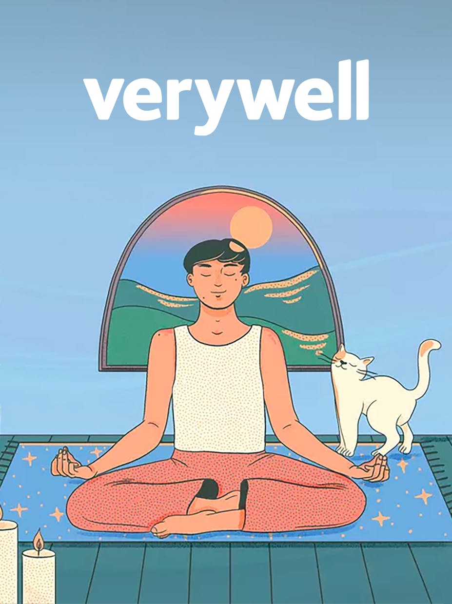
Trusted health information when you need it most

Jenneh Bockari & Joseph Rishe Wedding
A Stunning Wedding at the Historic Mission Inn Hotel & Spa in California
A Stunning Wedding at the Historic Mission Inn Hotel & Spa in California


Caleb Silver, Editor-in-Chief of Investopedia
Award-winning podcast from Investopedia
Award-winning podcast from Investopedia
To make decisions, take action and find inspiration

Food & Wine Classic in Aspen
A 3-day culinary experience with game-changing culinary leaders, innovative wine & spirits experts, and epicurean insiders
A 3-day culinary experience with game-changing culinary leaders, innovative wine & spirits experts, and epicurean insiders


Serious Eats researches deeply, tests rigorously, and pioneers
novel techniques for home cooks, like using a torch to recreate
the flavor of a restaurant-style stir-fry


Byrdie Beauty Lab Live Stream
How To Get Your Glow On with Hallie Gould & Erin Pulley
How To Get Your Glow On with Hallie Gould & Erin Pulley

We’re Back!
Getting your kids classroom ready (finally!)
Getting your kids classroom ready (finally!)

